
How to Build a Converting Landing Page: A Complete Guide

The short answer
A converting landing page has one clear offer, matches the traffic source that sent the visitor, and answers the questions needed before a decision. The first screen does the heavy lifting. Length follows the complexity of the offer and the temperature of the traffic. Test the headline, CTA, and proof first.
Contents
- What types of landing pages exist?
- What should the first screen contain?
- How do headlines and body copy work?
- How should you use images and video?
- How do you design and place the CTA?
- When should the page scroll and when should it not?
- What experience should the visitor go through?
- What should you A/B test and in what order?
- FAQ
- What to do next
The median dedicated landing page converts around 6.6% according to Unbounce’s analysis of more than 41,000 pages. Top performers clear 11%. Traffic source and offer type matter more than industry alone.
What types of landing pages exist?
Pages fall into a few practical categories:
- Short lead capture pages for simple offers (newsletter, free tool, download)
- Demo or trial pages for SaaS and software
- Long-form sales pages for higher-commitment or cold-traffic offers
- Video-led pages where demonstration is required
- Quiz or multi-step pages that qualify before the final ask
The right type depends on how much the visitor already knows and how big the commitment is. A free download for warm traffic can live on a short page. A high-ticket service for cold paid traffic usually needs more explanation.
What this means for your decision: Match page type to offer complexity and traffic temperature. Do not default to one length for every campaign.
For native campaigns, see landing pages and funnel types for Taboola and Outbrain campaigns.
What should the first screen contain?
Most visitors decide whether to stay within seconds. The first screen should answer:
- What is this?
- Is it for me?
- Why should I care?
- What do I do next?
- Does this match what I clicked?
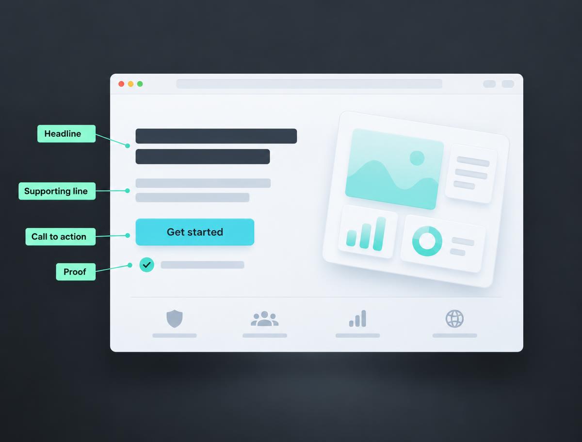
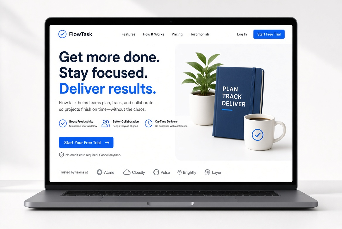
Include a clear headline, a short supporting line, a primary CTA, and one relevant visual or proof element. Message match with the ad or email is non-negotiable. If the page says something different from the ad, conversion drops.
What this means for your decision: If the first screen does not communicate the offer clearly, the rest of the page is wasted.
How do headlines and body copy work?
The headline is the highest-leverage text. Benefit-led headlines that state a specific outcome usually outperform feature-led or clever ones.
Unbounce data has shown that simpler copy (roughly 5th-7th grade reading level) converts nearly twice as well as more complex professional-level copy in some datasets.
Body copy should be scannable: short paragraphs, clear subheadings, and bullet points for benefits. Support claims with specific numbers or named examples rather than vague statements.
What this means for your decision: Write for clarity and specificity. Cleverness that requires effort to understand costs conversions.
How should you use images and video?
Images should show the product or outcome in context, not generic stock. Real product screenshots, interface examples, or customer results outperform abstract visuals.
Video helps when the product is hard to explain in text. Place short demos or explainers above the fold when possible. Autoplay muted loops can work for short clips. Longer sales videos usually perform better as click-to-play.
A 2026 study of 2,000 tested pages found single-stat heroes outperformed many visual patterns, while autoplay video heroes sometimes underperformed due to load time.
What this means for your decision: Use visuals that prove the claim. Do not add video or heavy images if they slow the page or do not answer a real question.
How do you design and place the CTA?
The CTA should state the outcome, not a generic action. “Get the free audit” outperforms “Submit” or “Learn more” in most tests.
Place a primary CTA above the fold. On longer pages, repeat the same CTA after major sections of proof or benefits. On mobile, consider a sticky bottom CTA so the action stays reachable.
Button contrast and size matter, but wording and placement usually move results more than color alone.
What this means for your decision: One clear action, repeated at decision points. Do not offer multiple competing next steps.
When should the page scroll and when should it not?
Short pages (often visible without much scrolling on desktop) work best for warm traffic and simple offers. Long pages work when the visitor has unanswered questions or the commitment is high.
A practical hybrid is common: a strong first screen that allows conversion, with additional proof, details, and FAQ below for those who need more. CTAs appear at multiple depths so the visitor can act when ready.
Test short versus long against your actual traffic. Cold paid traffic often needs more content than email or branded search traffic.
What this means for your decision: Length is a function of questions that must be answered, not a design preference. Measure scroll depth and conversion by source.
What experience should the visitor go through?
The ideal path is linear and low-friction:
- Land and immediately recognize the offer matches the ad or email.
- Understand the main benefit in the first screen.
- See enough proof or detail to reduce doubt.
- Encounter a clear, low-friction CTA at the moment of decision.
- Complete the action with minimal fields or steps.
Remove navigation that leads away from the goal. Cut form fields to only what is needed for the next step. Load the page quickly (under 2-3 seconds on mobile).
What this means for your decision: Design for the least convinced visitor who still matches the traffic source. Remove everything that does not help them decide.
Our website and landing page development services bring the offer, copy, design and conversion path together.
What should you A/B test and in what order?
Test one major variable at a time. Prioritize by impact:
- Headline and message match
- CTA wording and placement
- Form length and fields
- Hero visual (image vs video, or specific proof)
- Page length or section order
- Social proof format and placement
Run tests until you reach statistical significance (typically 95% confidence) with enough traffic. Most tests do not produce large lifts. Document results and build on winners.
Tools such as Optimizely, VWO, or native platform experiments are common. Focus on elements that affect the largest share of visitors first.
What this means for your decision: Start with the first screen and the CTA. Small design tweaks rarely beat fixing message match or friction.
FAQ
The cross-industry median is about 6.6%. Compare against your own traffic source and offer type rather than a universal number.
Not always. For simple offers it often helps. For complex offers, some visitors need more context before they are ready to fill a form.
Neither is universally better. Short pages work for warm traffic and simple offers. Long pages work when objections must be answered.
One primary action. Repeat it after major sections on longer pages. Do not introduce competing goals.
No. Short, relevant video can help. Long autoplay video that slows the page often hurts.
What to do next
Want a clear recommendation based on your actual channels and spend?
Talk to our team.
Talk to our team